


Context
TAN (Tangle Application Network) is a next-gen network leveraging Tangle infrastructure to offer feeless, scalable transactions for Web3 and AI use cases. It's essentially a cleaner, more future-forward fork of the Tangle Network. Built for decentralized growth, security, and innovation—no fees, no friction.
Team: I collaborated with a small, focused team: Linus, Garrett, and Sefear (handling messaging and vision), and a developer based in China who implemented the site.
Timeline: Fast-paced project over a few weeks, with quick iteration cycles.
My Role: I was the sole designer, responsible for:
- Building the visual brand from scratch
- Creating logos, typography, and color systems
- Designing the full website (UX and UI)
- Collaborating with dev and stakeholders for implementation
The Business Need
TAN was launching and needed a digital home—a site that looked sharp, felt premium, and explained its value clearly. The stakeholders wanted something minimal, clean, and modern. Think Web3-savvy, not overloaded with buzzwords.
They came to me based on the work I’d done on the Tangleverse project for IOTA and trusted me to bring the same level of clarity and visual strength to TAN.
Getting Aligned
The team had strong opinions and references upfront—sites like Bittensor were mentioned. Instead of deep UX research, the focus was:
- Clear and punchy messaging
- Simple, focused navigation
- A strong visual identity that stood out
I started by establishing the brand compass:
- Brand Archetype: The Creator (thrives on innovation and bringing life to a vision)
- Tone: Community - Centric, Transparent, Clear, Visionary, Trustworthy.
- Color Palette: We explored both dark and light schemes. Ultimately, we leaned into a dark aesthetic—it felt more aligned with the crypto-native vibe, and testers responded better to it.


Design Process
Once the brand foundation was agreed on, I:
- Created Personas: Focused on two key user types—Web3-native builders and curious developers looking for a better blockchain infrastructure.
- Sketched Flows: Mapped how each type of visitor would explore the site, focusing on clarity of value prop and simplicity of movement.
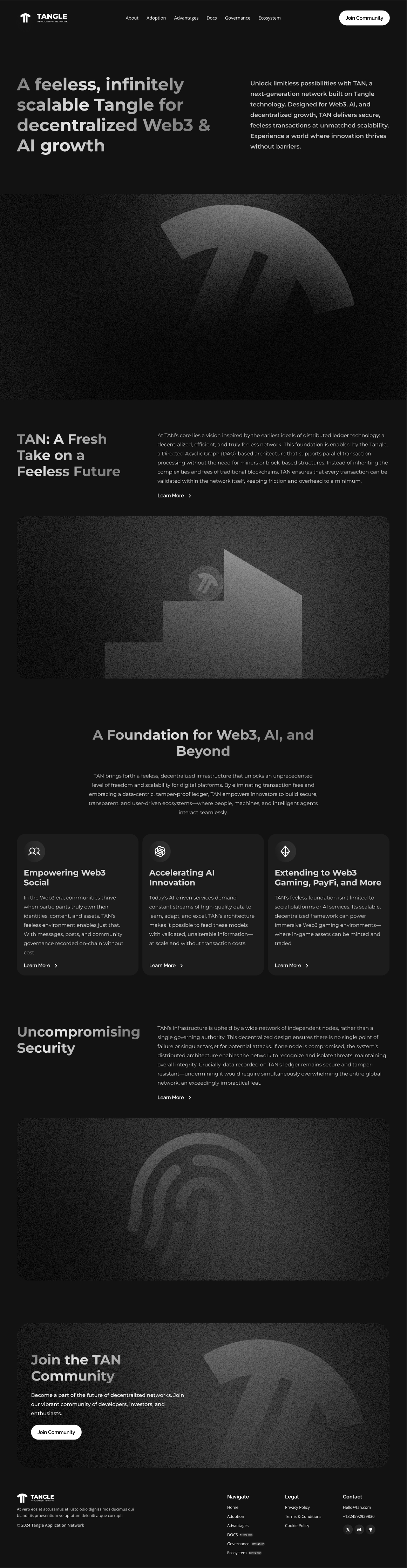
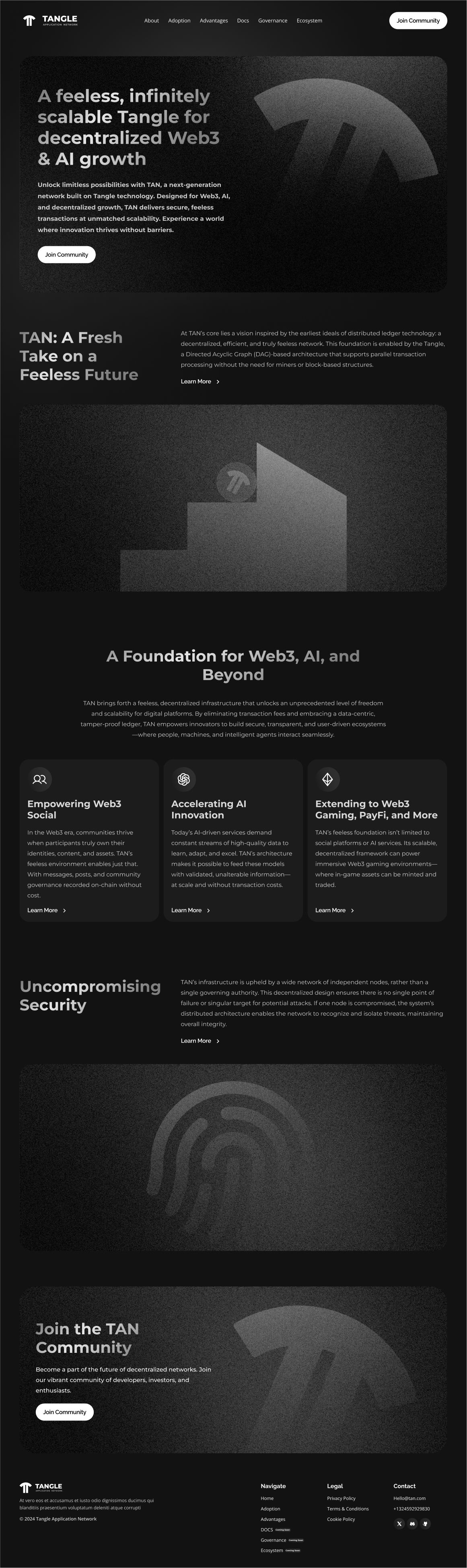
- Created 3 website iterations exploring different layouts and theme (Light/dark)
- Tested with Community: Shared design iterations with early community members—collected fast feedback through Discord. Most preferred the dark theme and clean layout. The light version felt too generic.
We leventually anded on Version 3. Stakeholders felt it hit the sweet spot between minimal, clean and functional.


Key Design Decisions
- Dark Mode: Dark aesthetic gave us more control over contrast and visual hierarchy. It also resonated more with the Web3 community.
- Clear Messaging: We trimmed unnecessary sections and used short, declarative copy to match the project's bold ambition.
- Clean Navigation: No overwhelming animations. Just smooth, modern UX.
Deliverables
- Brand compass
- Brand archetype & tone
- Visual identity (logo, colors, typography)
- User personas
- 3 site iterations in Figma
- Final high-fidelity prototype for handoff
Business Outcomes
- TAN successfully launched with a brand and website that users praised for clarity and elegance
- The site helped TAN position itself as a serious, next-gen crypto network
- Early community sentiment has been overwhelmingly positive.
What’s Next
TAN just launched its token. We're monitoring engagement, watching how users interact with the site and brand. Based on that, we'll iterate if needed—but so far, the foundation is strong.
What I Learned
- When clients already have a strong vision, your job shifts from discovery to interpretation—translating their ideas into something beautiful and functional.
- Branding isn’t just logos—it’s emotional resonance. The Creator archetype shaped everything: colors, voice, visuals.
- Web3 users value clarity. Cutting through hype with design is often the differenting factor.