


The Backstory
Boxes of Houston is a newly launched packaging company based in—you guessed it—Houston. They’re on a mission to become the go-to packaging partner for local businesses, offering reliable, affordable solutions for shipping and storage.
But while they were ready to take on clients, their digital presence wasn’t. Most of their competitors had websites that looked like relics from the early 2000s—clunky layouts, outdated fonts, and unclear messaging. Boxes of Houston knew they needed something different: a modern, professional website that would actually reflect the quality of their service.
Why They Reached Out
I was brought in as the web designer to help them build something that stood out in their space. The ask was clear:
“We don’t want to look like every other packaging company.”
They wanted a clean, minimal site that communicated trust, clarity, and professionalism—without overwhelming visitors. This wasn’t just about looking good. It was about signaling to potential clients that they were a serious, reliable partner.
Project Scope & Timeline
- Duration: About 6 weeks from kickoff to launch
- My Role: Sole web designer handling everything from UX strategy to visual design to final WordPress implementation
- Deliverables: Brand identity, logo, business cards, website (responsive), and a few print-ready banners
How I Approached It
1. Researching the Competition
Before designing anything, I did a competitive audit of other packaging businesses—especially those based in Texas. I wasn’t just looking for inspiration; I was looking for gaps. Most competitor sites were:
- Visually outdated
- Cluttered
- Lacking clear calls to action
This told me everything I needed to know: there was a real opportunity to win on clarity and design.
2. Defining the Experience
Boxes of Houston had a strong value proposition: reliability, affordability, and a local touch. I made sure this was front and center in the design—from the homepage copy to the product/service pages.
Key decisions included:
- Minimalist layout: To avoid overwhelming users and let the content breathe
- High contrast and clean typography: For readability and a more premium feel
- Straightforward navigation: Because nobody wants to dig through five menus just to find a contact form
I also made sure the site was fully responsive. A lot of their clients would likely be browsing from a warehouse floor or office mobile device—not just a desktop.
3. From Figma to Final Build
I started with designing in Figma to define layout and structure, then moved into high-fidelity mocks with real content. Once the Shahir (my client) was happy with the direction, I transitioned to building the full site in WordPress.
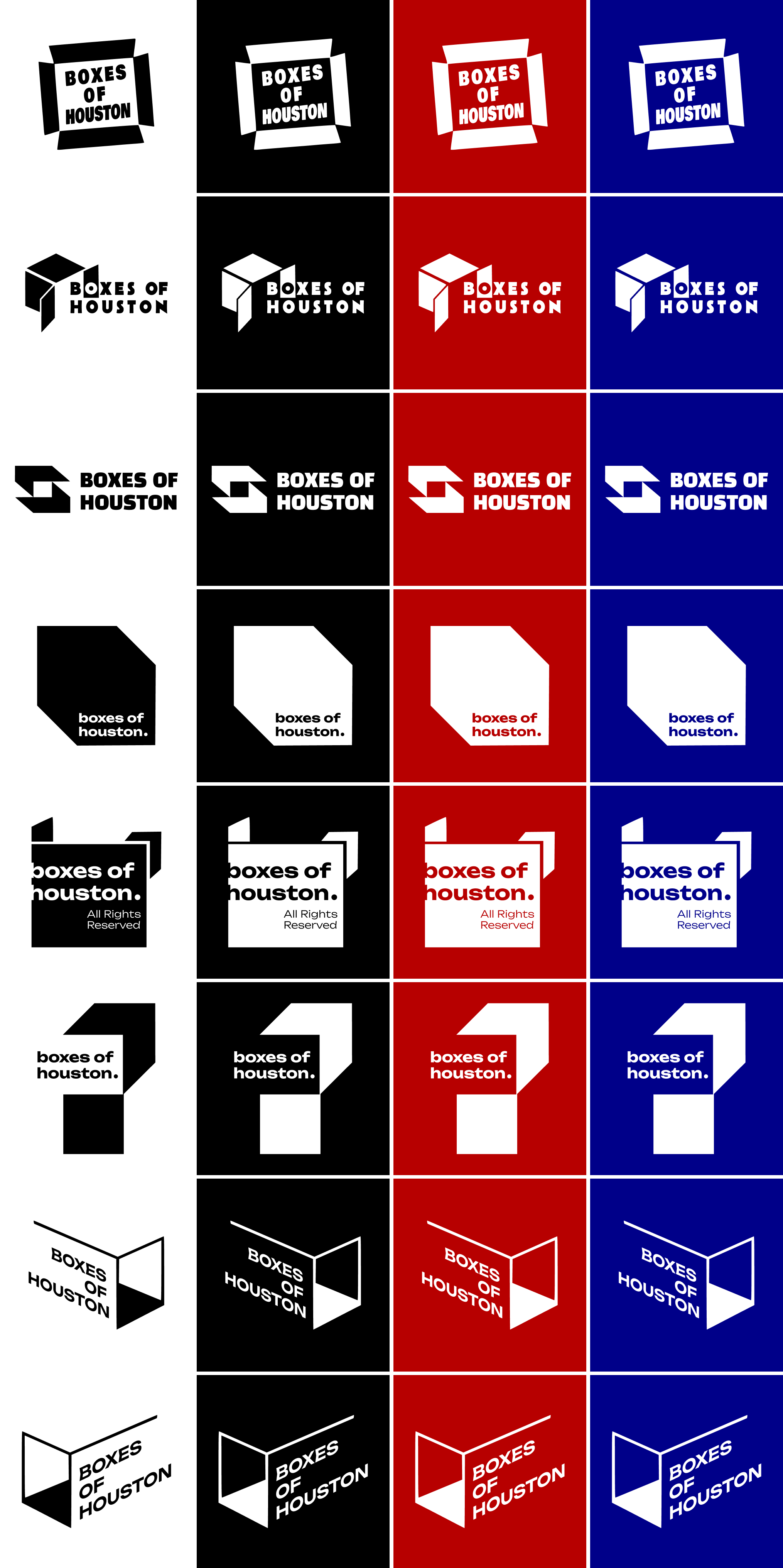
Along the way, I designed some brand assets, selected brand colors and typefaces, and created supporting brand materials like business cards and banners. Everything was designed to feel cohesive and modern.

4. Testing & Iteration
Since we didn’t have a large user base to test with, I ran lightweight usability checks internally and with the client team. I paid close attention to:
-
- Mobile responsiveness
- CTA placement and visibility
- Page load speed (especially for product-heavy pages)
Feedback helped me simplify a few button labels and adjust some padding for smaller screens. Nothing major—but enough to tighten up the experience.


Impact & What’s Next
The new site went live, and early feedback has been really positive. Shahir feels confident directing potential customers to the site, and they’ve already started seeing traction with inbound inquiries.
Next up, they’re planning to expand the site with an eCommerce section—using Odoo—to allow customers to browse and order packaging supplies directly online. That’s a feature I may help them roll out in the near future.
What I Took Away
This project reminded me how far clarity and simplicity can go—especially in industries where the competition hasn’t evolved much digitally. It also reinforced that UX doesn’t always mean reinventing the wheel; sometimes it just means giving users what they need, faster and cleaner.
Designing the foundation for a brand’s first impression? That’s always exciting. But doing it in a way that helps them stand tall in a crowded market? Even better.