


Context: A Bold Vision for Borderless Private Travel
Aeroverse is building something bold—a platform that connects private jet owners, charter operators, and business travelers across the globe via Telegram. But as forward-thinking as the idea was, the app’s UX just wasn’t taking off. Bookings were low. User engagement was lagging. The app felt more like a patched-together website than a seamless travel tool.
That’s where I came in.
Why I Was Brought In
The founder, JP, reached out to me with a clear message:
“Make it beautiful. Make it make sense.”
Users were getting lost trying to book flights. The interface was cluttered, the booking flow was clunky, and it just didn’t feel intuitive. My job was to seriously rethink the experience from the ground up and redesign it into something people actually wanted to use.
Where We Started: The Problems on the Ground
Before touching base, I dug into what wasn’t working:
- Hard-to-navigate mobile interface: It felt like a broken desktop site squeezed onto a phone.
- Overwhelming visual noise: Distracting colors and uneven layouts made it hard to focus.
- Confusing booking flow: Booking a flight took too many steps. Most users just gave up.
Through conversations with early users on the Telegram channel and reviewing the existing UI, it was clear: we needed to simplify the UX—fast.
My Process
- Audit & Research
I reviewed the current app, listened in on conversations in the Telegram community, and took notes on friction points. What was frustrating? What wasn’t clear? Why were users bouncing? - Redefining the Booking Flow
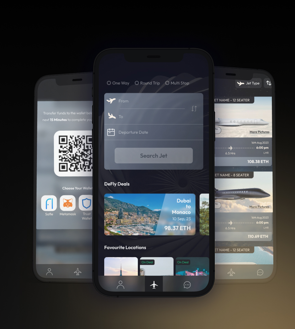
The booking process was the heart of the app, and it needed surgery. I stripped it down and rebuilt it so users could book a flight in three taps or less. - Mobile-First Redesign
I ditched the old “web feel” and leaned into mobile-first principles—clean layouts, intuitive navigation, and clear call-to-actions. - Brand Alignment
I updated the visuals with Aeroverse’s new color palette to create a more premium, cohesive feel that matched their brand vision. - Prototyping & Testing
Once the new designs were ready, I created an interactive prototype and shared it with Aeroverse Club members. We ran unmoderated usability testing to see if they could navigate the app without any help.
Key Design Decisions
- Simplified Home Screen: Only essential actions remained. Everything else got moved to dedicated pages to reduce clutter.
- 3-Tap Booking: From start to finish, users could find and book a flight with just three taps.
- Modular UI Blocks: These made it easy to scale as more services are added in the future.

Artifacts I Created
- High-fidelity mobile-first wireframes and prototypes
- Redesigned booking flow
- Visual redesign using new brand identity
- Usability testing plan and feedback summary
The Impact
A few weeks after rollout, we saw:
- More user adoption
- Higher engagement within the Telegram community
- Fewer questions about how to book flights (a good sign the UX was UXing - doing its job)
It’s still early days, but the feedback from Aeroverse members—and the founder—has been overwhelmingly positive.
What’s Next?
We're in the observe-and-refine phase. The goal now is to monitor user behavior post-launch and continue improving based on how they use the app in the wild.
What I Learned
This project reinforced something I’ve seen many times but always love relearning:
Even bold, futuristic ideas fall flat without thoughtful UX.
Designing for Telegram added some unique constraints, but also a fun challenge—how do you make something feel intuitive on a platform that wasn’t built for this? It turns out that simplicity always wins. What's that saying again?.....don't look for what to add but look for what to subtract....right?